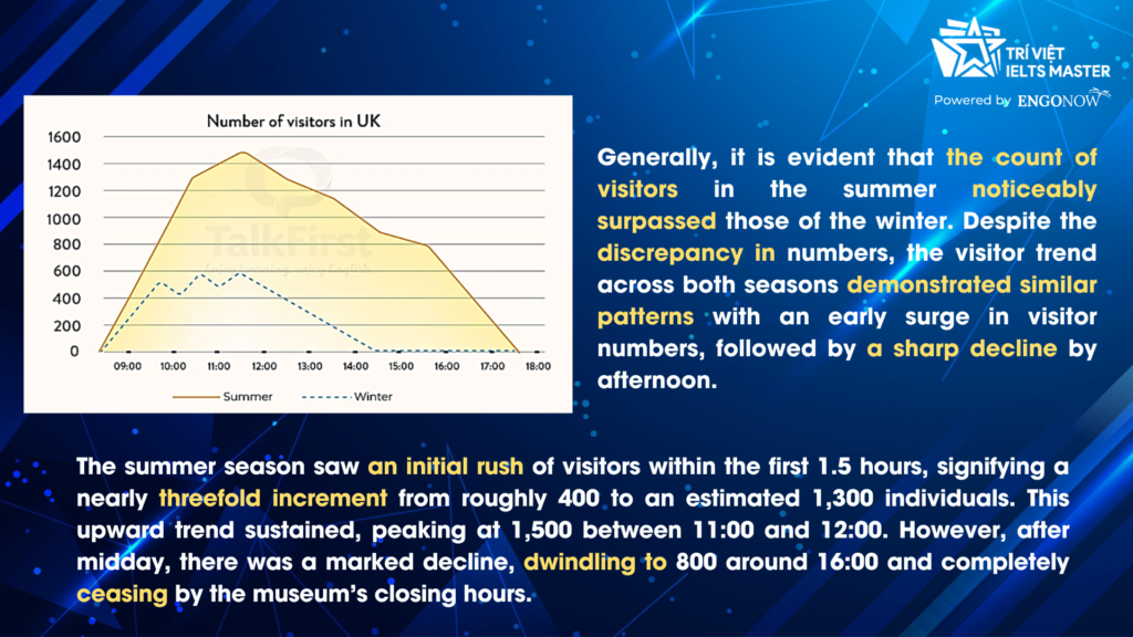
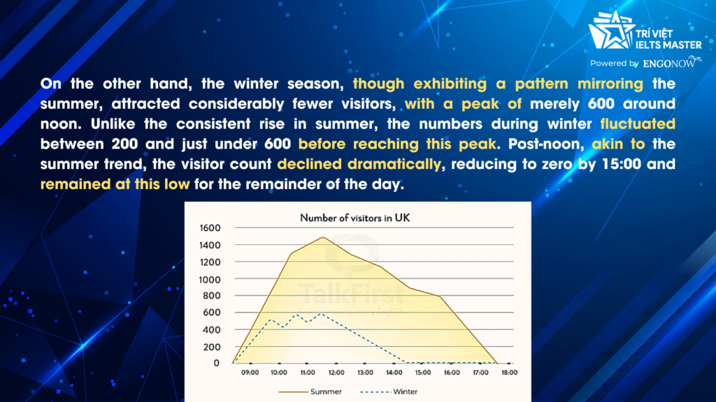
The line graph shows information about the average number of visitors entering a museum in summer and winter in 2003.
Summarise the information by selecting and reporting the main features, and make a comparison where relevant.
Chào các bạn, mình là Khang đến từ Trung tâm Ngoại ngữ IELTS MASTER – ENGONOW. Hôm nay mình rất vui khi có thể chia sẻ đến các bạn bài mẫu đề thi thật Task 1 năm 2023 nhé.
GIỎI TIẾNG ANH – CHUẨN IELTS – HỌC IELTS MASTER
http://ieltsmasterhcm.com


Sample:
The line graph offers insights into the average number of individuals who frequented a museum in the United Kingdom during the summer and winter seasons of 2003.
Generally, it is evident that the count of visitors in the summer noticeably surpassed those of the winter. Despite the discrepancy in numbers, the visitor trend across both seasons demonstrated similar patterns with an early surge in visitor numbers, followed by a sharp decline by afternoon.
The summer season saw an initial rush of visitors within the first 1.5 hours, signifying a nearly threefold increment from roughly 400 to an estimated 1,300 individuals. This upward trend sustained, peaking at 1,500 between 11:00 and 12:00. However, after midday, there was a marked decline, dwindling to 800 around 16:00 and completely ceasing by the museum’s closing hours.
On the other hand, the winter season, though exhibiting a pattern mirroring the summer, attracted considerably fewer visitors, with a peak of merely 600 around noon. Unlike the consistent rise in summer, the numbers during winter fluctuated between 200 and just under 600 before reaching this peak. Post-noon, akin to the summer trend, the visitor count declined dramatically, reducing to zero by 15:00 and remained at this low for the remainder of the day.
(By Khang IELTS- IELTS MASTER HCM- ENGONOW- Band 8.5)
Xem thêm: Bài mẫu IELTS WRITING TASK 1: BAR GRAPH – WORK PERFORMANCE


